Name, browser title, browser icon and CSS
Display name
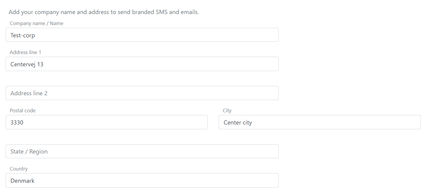
Name and address for you company, organisation or system can be configured on each environment. When FoxIDs send an SMS or email to a user the SMS and email text is customised by adding the information.
The name and address is configured in the environment settings in FoxIDs Control Client.
- Select Settings
- Select Environment
- Fill in the name and address
- Click Update
Add browser title, browser icon and CSS
The FoxIDs user interface can be customised per login authentication method. This means that a single FoxIDs environment can support multiple user interface designs with different browser titles, browser icons and CSS.
If you do not specify a login authentication method as an allowed authentication method in your application. The default login authentication method is used and also what is customised in it.
FoxIDs use Bootstrap 4.6 and Flexbox CSS.
Find the login authentication method in FoxIDs Control Client that you want to configure.
- Select the Login UI tab
- Add the Browser Title text
- Add the Browser Icon URL from an external site, supported image formats: ico, png, gif, jpeg and webp
You can also paste an inline data URI such as
data:image/png;base64,...to embed the icon directly - Add your CSS, if necessary drag the field bigger
Optionally use CSS snippets by clicking the Generate CSS snippets link - Click Update
After update the title, icon and CSS is instantly active.
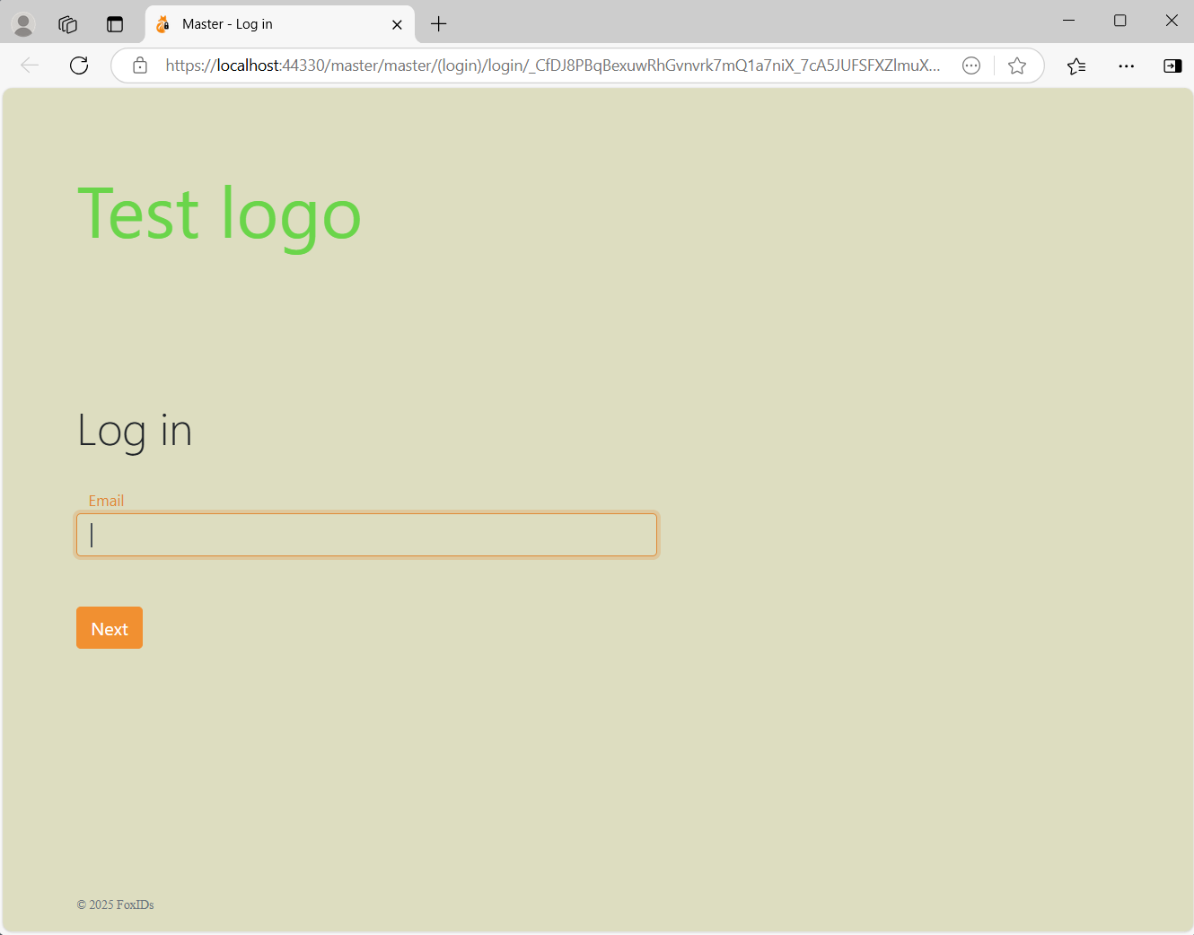
CSS examples
Change background and add logo text.
body {
    background: #ddddc0;
}

.brand-content-text {
    visibility: hidden;
}

.brand-content-text::before {
    color: #6ad54a;
    content: "Test logo";
    visibility: visible;
    display: block;
    font-size: 4rem;
    font-weight: 400;
    line-height: 1.6;
}
It is also possible to use a logo image.
.brand-content-text {
    display: none;
}

.brand-content-icon::before {
    content:url('https://some-external-site.com/logo.png');
}
You can also embed the logo image directly in the CSS with a data: URI to avoid external requests.
.brand-content-text {
    display: none;
}

.brand-content-icon::before {
    content:url('data:image/png;base64,iVBORw0KGgoAAAANSUhEUgAAAAEAAAABCAQAAAC1HAwCAAAAC0lEQVR42mP8/x8AAusB9FHSMNcAAAAASUVORK5CYII=');
}
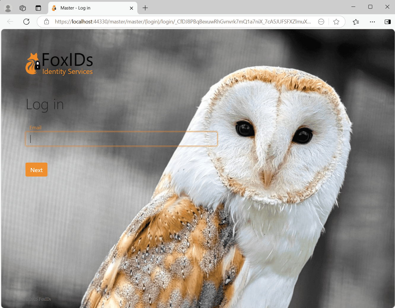
Add a background image from an external site.
body {
    background: #FFF;
    background: url(https://some-external-site.com/image.png);
    background-position: no-repeat center center fixed;
    background-color: inherit;
    background-repeat: no-repeat;
    background-size:cover;
}
Change button and link color, in this example CSS to green.
label {
    color: #a4c700 !important;
}

.input:focus {
    outline: none !important;
    border:1px solid #a4c700;
    box-shadow: 0 0 10px #a4c700;
}

.btn-link, .btn-link:hover, a, a:hover {
    color: #a4c700;
}

.btn-primary.disabled, .btn-primary:disabled {
    color: #fff;
    background-color: #afc44f;
    border-color: #afc44f;
}

.btn-primary, .btn-primary:hover, .btn-primary:active, .btn-primary:focus, .btn-primary:active {
    background-color: #a4c700;
    border-color: #a4c700;
}

.btn-primary:not(:disabled):not(.disabled).active, .btn-primary:not(:disabled):not(.disabled):active, .show>.btn-primary.dropdown-toggle {
    background-color: #7c9600;
    border-color: #7c9600;
}

.btn-link:not(:disabled):not(.disabled):active, .btn-link:not(:disabled):not(.disabled).active, .show>.btn-link.dropdown-toggle {
    color: #a4c700;
}

.btn:focus, .form-control:focus {
    border-color: #a4c700;
    box-shadow: 0 0 0 .2rem rgba(64,78,0,.25);
}

.btn-primary:not(:disabled):not(.disabled).active:focus, .btn-primary:not(:disabled):not(.disabled):active:focus, .show>.btn-primary.dropdown-toggle:focus {
    box-shadow: 0 0 0 .2rem rgba(64,78,0,.25);
}
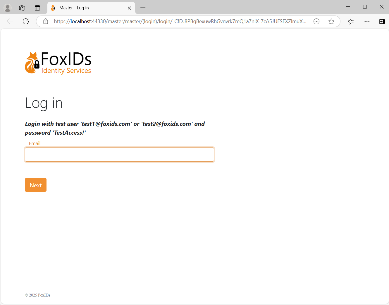
Add information to the login box.
div.page-content::before {
    font-weight: bold;
    font-style: italic;
    content: "Login with test user 'test1@foxids.com' or 'test2@foxids.com' and password 'TestAccess!'";
}
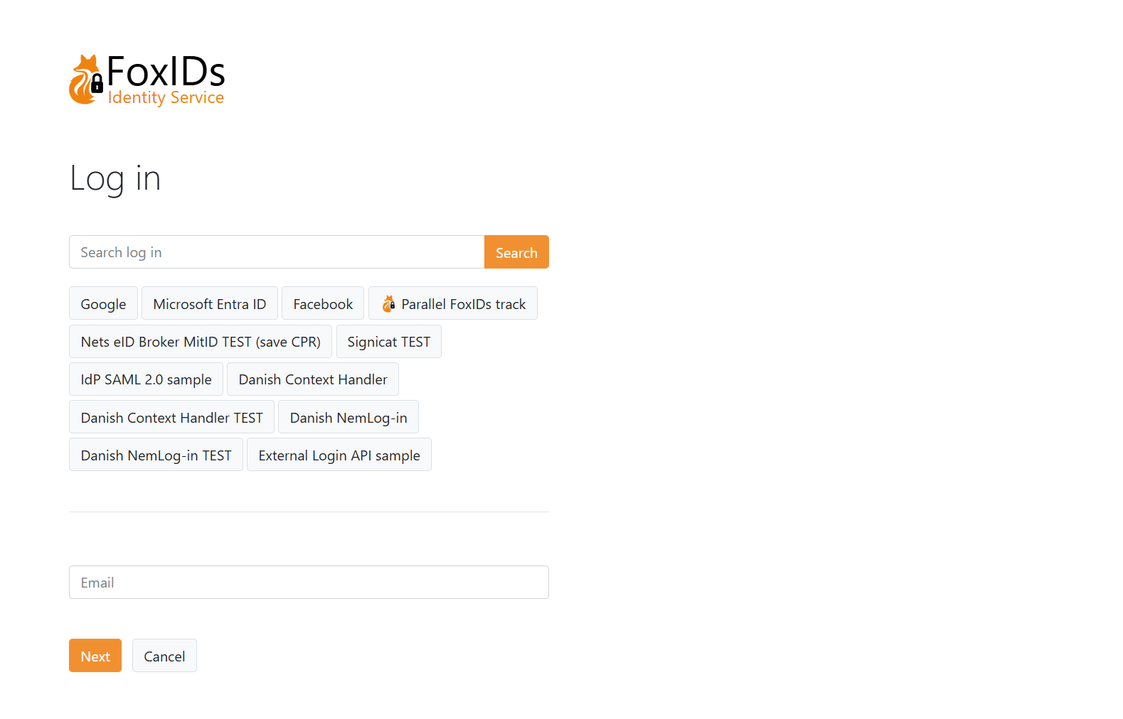
Show the select where to login (HRD) section before the login box.
.col-md.page-content {
  display: flex;
  flex-direction: column;
}

.col-md.page-content form {
  order: 2;
}

.col-md.page-content #form-filter {
  order: 1;
}

#form-filter {
  display: flex;
  flex-direction: column;
}

#form-filter .info-message-filter {
  display: none;
}

#form-filter .dividing-line {
  order: 999;
}
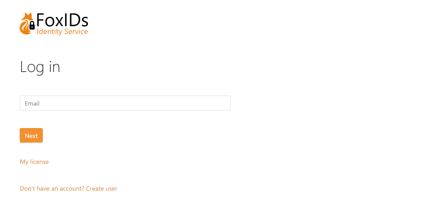
Add HTML to the Login UI
You can change the login page by adding text and HTML elements. There are placeholders for the input fields (username / password etc.), buttons, links and authentication choices (HRD). You can place the text and HTML elements between the placeholders and change the order of the placeholders.
Find the login authentication method in FoxIDs Control Client that you want to configure.
- Select the Login UI tab
- Select Show advanced
- Click the Add element
- Then e.g. click HTML element
- Move the HTML element with the arrows
- Add e.g. a link to your license
- Click Update
The login page now include your license link. To customise further you can add a CSS class on the HTML element and add a CSS class in the CSS input field.